Saturday, April 25, 2009

Star plots


Star plots allow you to compare multiple variables for each observation. The plot above contains the star plots of 16 cars. The variable list for star plot is 1 Price, 2 Mileage (MPG), 3 1978 Repair Record (1 = Worst, 5 = Best), 4 1977 Repair Record (1 = Worst, 5 = Best), 5 Headroom, 6 Rear Seat Room, 7 Trunk Space, 8 Weight, and 9 Length.

Similarity matrix


This image is of a differential expression signature similarity matrix. In the upper-right triangle region, dark red colors indicate high similarity between signatures associated with two contrasts . The binary coding in the lower-left triangle region indicates whether signatures associated with two contrasts exhibit a significant level of similarity. Similarity maxtrixs are geovisual representations. A similarity matrix shows how similarities and differences on scale from a scale from 0 to 1.

Stem and leaf plot


The stem-and-leaf plot above shows the average annual income data for the countries in Western Africa. Stem-and-leaf-plots graph numerical data in order to calculate the mean of the data.

Box plot


A boxplot, also known as a box and whisker diagram, provides a simple graphical summary of a set of data. This is a vertical box plot which shows the ranges of a signal with the Mean falling between 25 and 50 percent.

Histogram


A histogram displays total frequency of the displayed data. This chart shows the results of a final exam given to a hypothetical class of students. Each score range is denoted by a bar of a certain color

Parallel coordinate Plot graph


In the parallel coordinate plot above, each variable is graphed on a vertical axis. The data is plotted as a connected set of points. Parallel coordinate plot graphs are a type of Geovisual representation.

Triangular plot


The triangular plot above calculates the odds of winning an election for three candidates based on their percentage of a type of vote. Triangular plots show percentages based on three major factors with the data plotted in relation to these factors.

Wind rose


The image above shows the night time wind peaks 10 PM and 6 AM LST from September 1, 2004 to August 31, 2005 in Albuquerque, New Mexico. A Wind Rose Plot is a Geovisual representation of a circular plot that shows frequencies of wind direction during a point in time.

Climograph


Climographs are graphic representations of the relation between temperature and precipitation as plotted at monthly intervals throughout the year. This graph displays the mean monthly maximum and minimum temperature and total precipitation for the period 1971 - 2000.

Population profile/ pyramid


A population pyramid is a specialized type of horizontal bar chart. Population pyramids are used to show the age and sex distribution of a population at a certain point in time. The image above was created using in Excel, it it shows a comparison of percentages between males and females.

Scatterplot


The image above is a Scatterplot which shows the relationship between Alpha and Beta points. Scatterplots are Geovisual representations that use dots to represent data as it relates to a constant. The closer the dots are towards the center the more consistants there are.

Index value plot


The image above is Index value plot that shows the S & P 500 stock market closing values over a 10 year period. A type of Geovisual representation index value plots calculate data positive and negative data over a specific time period.

Accumulative line graph or Lorenz curve


A form of Geovisual representation the Lorenz curve/Accumulative line graph plots data in its actual amounts as it relates to an equal constant. The chart above shows a comparison of the average incomes of 5 different classes to percentage of households in 1978.

Bilateral graph


The chart above shows a bilateral comparison of tied aide and technical assist in relation to relief aide support to foreign countries from 1990-2004. A Bilateral graph is a type of geovisual representation that shows a comparison two types of data.

Nominal area choropleth map


Nominal area choropleth maps use are used to display nominal data. This image above reflects world bank figures in billions of U.S. dollars based on the Gross Domestic Product per country.

Standard/Standarized choropleth map

This map shows the population from ages 14 and under 2006 in Canada. Standard choropleth maps convey standardized data based on percentage of area.

Univariate choropleth maps

Univariate choropleth map shows only one specific set of data. The map above shows the percentage of people living in poverty, by county, in the Untied States during 2000.

Bivariate choropleth maps


A Bivariate choropleth map shows two specific sets of data. This image above shows the average income verses population by county in the state of Ohio in 1997.

Unclassed choropleth maps


In an unclassified choropleth map the numeric attribute values are represented by proportional degrees of darkness. Meaning the higher attribute an area has the darker the shading. This map shows the fertility rate of women in Europe with Albania having the highest rate of children born per woman.

Classed choropleth maps

A Classed choropleth map is type of thematic map in which are colored or shaded to reflect the values of the different a classes mapped. The image above is taken from a 2000 Census of the number of male per 100 females in the U. S. by state.

Range graded proportional circle map

The image above is in "grey scale" format it represents the population distribution of Canada in 1980 with the largest circles representing the most populated areas. The data is split into groups while using classification procedures which is common in choropleth mapping. A Range graded proportional circle map is a circle map that uses circle size in relation to data ranges or groups.

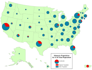
Continuously variable proportional circle map


Continuously variable proportional circle maps use circles and pie charts to show percentages of population. This image shows the percentage of Hispanic population compared to total population by state.

Tuesday, April 14, 2009

DOQQ


This image is a DOQQ image of Texas using the UTM coordinate system. The digital orthographic Quarter-Quads is a aerial photograph that has been orthorectified and georeferenced. They offer display features that maybe generalized on other maps.

DEM


A Digital Elevation Model is a digital file with terrain elevations for ground positions occurring at regularly spaced horizontal intervals. DEMs can use 3-D images or colorization to bring out relief. The image above is a DEM image that shows the locations of the 16 AOI (Areas of Interest) where potential traps are associated with predicted or identified reservoir units (indicated by the red polygons).

DLG


This image is of a 3-D map of the Foothills Parkway,Tennessee. Digital line graphs (DLG) contain a wide variety of information like boundaries, roads and utility lines. Data about the maps are stored as lines, points and areas.

DRG

Digital Raster Graphics (DRGs) are scanned images of U.S. Geological Survey topographic maps. The image inside the map is georeferenced to the surface of the earth, which makes it possible to use DRG as a map layer in many GIS software. The DRG image above is the city of Austin, Texas.

Isopleth Map


An isopleth map is a type of contour map that generalizes and simplifies data using a constant line. It shows the data as a third dimension on a map. The image above compares ozone levels in the atmosphere between January - December from 2003 to 2004.

Isopach map

Isopach maps are a type of a contouring map that uses lines, also known as isolines to represent rock or sediment thicknesses. This image shows sediment elevation data from East Asia which was compiled by the Committee for Coordination of Offshore Mineral Resources Prospecting.

Isohyet Maps


This image shows the average annual rainfall in Tasmania, Australia from 2003. Isohyet maps are a type of contour map which use contour lines to represent rainfall.

Isotachs


Isotachs are a type of contour map that measures wind speed. This image was taken on July 29th 1997, Meteosat WV image; yellow: isotachs 300 hPa, black: shear vorticity 300 hPa; SatRep overlay. In this image yellow lines represent isotachs, lines encompassing areas of equal windspeed.

Isobars

Isobars are a type of contouring map the use rigid lines to represent air pressure. Isobars join points of equal pressure, measured in mb (millibars). This map shows the flow of air in relation to high and low pressure areas.

Monday, April 13, 2009

LIDAR Map

LIDAR (Light detection and ranging) systems are one form of remote sensing. In this image, scientists use computer generated 3D visualizations of multiple LIDAR data sets to represent new levels of archeology data analysis.

Doppler Radar

Doppler Radar is a type of remotely -sensed map which utilizes microwaves to track direction and speed of suspended water droplets in the atmosphere. This image is taken from a Doppler Radar showing the movement of Hurricane Katrina on August 28, 2005.

Black and white aerial photo


The image above is a black and white aerial photograph of Logan International Airport in Boston, Massachusetts. Black and white aerial photography is a type of remote sensing which uses black and white emulsion similar to the wave links used by the human eye.

Infrared aerial photograph


Infrared aerial photography is a type of remote sensing which uses emulsion sensitive to wavelengths which are outside normal human vision. Infrared imagery uses false color to represent the wavelengths can't actually see. This image is a infrared aerial photograph of the Lyndon B. Johnson Ranch taken in 1995.


Cartographic animations


Cartographic animation uses both 2D and 3D imagery to provide dynamic visual aspects of atmospheric events. It is used significantly in modern weather forecasting. The image above is an animated representation of the earth in movement.

Statistical map

The Statistical map above shows the total number of flood claims by state made between September 2004 and September 2005 according to the National Flood Insurance Program. Statistical maps can communicate relative map scale based on the data. Distances and areas can maybe be distorted in relation to population or values.


Flow maps


Flow maps are a type of line pattern map. They use bold lines to represent a desired path. This flow map was used in 2006 for a proposed satellite office locations.

Saturday, April 4, 2009

Isoline map


Isoline maps are a type of contouring map which are used extensively in meteorology. In this map masked insolines lines are used to represent a rigid constant of temperature across the United States.

Cartograms

Cartogram maps are created by substituting standards of measure for distance or area. In this map country sizes are represented by the number of plant species and not actual land mass.


Proportional circle map


Proportional are a type of a point pattern map that uses point data mapped with a circle instead of a dot. In this map, the area of each circle is proportional to a value in a data set.

Choropleth map


Choropleth maps are a type of area map that portray areal data. In this example, we see the percent of divorced people by state in 1980. The dark green areas represent the highest number of divorces in America.

Dot density/distribution maps


Dot distribution/dot density are a type of point pattern map.They use nonporportional point symbol which means the dots do not vary in size. This example come from a 2004 census of the amount and location of poor people in America. Each dot respresents 200 persons living in a nometro county.

Friday, April 3, 2009

Propaganda maps


Propaganda maps are designed to persuade, often for political reasons, the person viewing them utilizing cartographic representation. This image from 1914 is a humorous depiction of Europe from a German cartographer. Images uses symbolism to depiction turmoil of the region at the time.